My AgroLink Farmers’
Marketplace
My AgroLink
Farmers’ Marketplace
Bayer wanted to create a one-stop digital platform for smallholder farmers in Southeast Asia and Pakistan.
The goal was to give them easier access to Bayer products, advice, and rewards through a self-service mobile app that worked both online and offline. As the design team, our task was to improve the user experience of the existing myAgroLink app by simplifying core journeys and addressing farmers' key barriers to digital adoption.
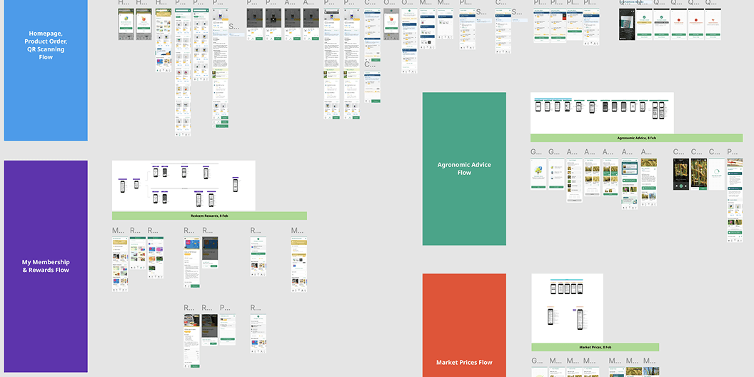
Over 2.5 months, we designed, tested, and iterated a
new Android MVP grounded in user needs.
Bayer wanted to create a one-stop digital platform for smallholder farmers in Southeast Asia and Pakistan. The goal was to give them easier access to Bayer products, advice, and rewards through a self-service mobile app that worked both online and offline. As the design team, our task was to improve the user experience of the existing myAgroLink app by simplifying core journeys and addressing farmers' key barriers to digital adoption. Over 2.5 months, we designed, tested, and iterated a new Android MVP grounded in user needs.
CLIENT: BAYER
BAYER
YEAR: 2021 - 2022
2021-2022
ROLE: DESIGN LEAD
DESIGN LEAD
The Problem
The Problem
Most smallholder farmers are digitally challenged and unfamiliar with online ordering. Many rely on advisors or face-to-face interactions to get what they need. At the same time, the agricultural ecosystem is complex, and unfamiliar technology often becomes a barrier.
Most smallholder farmers are digitally challenged and unfamiliar with online ordering. Many rely on advisors or face-to-face interactions to get what they need. At the same time, the agricultural ecosystem is complex, and unfamiliar technology often becomes a barrier.
Over 2.5 months, we had to work through these challenges:
Over 2.5 months,
we had to work through these challenges:
Design for farmers with low digital literacy and limited confidence with technology
Design has to be easy to learn, reducing barriers
to adoptionUnderstand what would entice farmers to adopt and keep using the app (e.g. rewards, convenience, advice)
Assess whether an app was the right solution for this context, and if so, what would genuinely support farmers and be easily understood
Design for farmers with low digital literacy and limited confidence with technology
Design has to be easy to learn, reducing barriers to adoption
Understand what would entice farmers to adopt and keep using the app (e.g. rewards, convenience, advice)
Assess whether an app was the right solution for this context, and if so, what would genuinely support farmers and be easily understood
To keep the team aligned and moving quickly:
We ran daily standups with the client to align cross-functional progress
Within the design team, we held both morning standups and end-of-day catchups to track progress, unblock issues, and iterate collaboratively
Weekly feedback sessions were held with the client
to keep team aligned and ensure design integrity
User & Business Needs
User & Business Needs
Before defining flows and features, we needed to ground ourselves in who we were designing for and what success looked like. The primary audience, smallholder farmers with low digital literacy, was predefined. Our role was to unpack what that meant in context of a marketplace app and align with Bayer’s goals through regional stakeholder interviews.
Before defining flows and features, we needed to ground ourselves in who we were designing for and what success looked like. The primary audience, smallholder farmers with low digital literacy, was predefined. Our role was to unpack what that meant in context of a marketplace app and align with Bayer’s goals through regional stakeholder interviews.
Primary Users:
Smallholder Farmers
Primary Users:
Smallholder Farmers
Digitally limited, but open to using the app if it helps them improve yields, reduce risks, or earn rewards.
Their needs:
A familiar and intuitive shopping experience
Incentives for continued use (points, rewards)
Quick access to farming advice and support
Digitally limited, but open to using the app if it helps them improve yields, reduce risks, or earn rewards. Their needs:
A familiar and intuitive shopping experience
Incentives for continued use (points, rewards)
Quick access to farming advice and support
Secondary Users:
Advisors
Secondary Users:
Advisors
Act as intermediaries between Bayer and farmers.
Their needs:
Efficient workflows to support farmers
Access to verified product and pricing information
Act as intermediaries between Bayer and farmers. Their needs:
Efficient workflows to support farmers
Access to verified product and pricing information
Business Goals
Business Goals
Encourage digital adoption among farmers to:
Reduce risks from counterfeits via direct-to-farmer ordering
Reinforce loyalty through points and redemption
Improve farmer effectiveness via agronomic advice and relevant features
Encourage digital adoption among farmers to:
Reduce risks from counterfeits via direct-to-farmer ordering
Reinforce loyalty through points and redemption
Improve farmer effectiveness via agronomic advice and relevant features
Here are some changes
I've made based on the user insights:
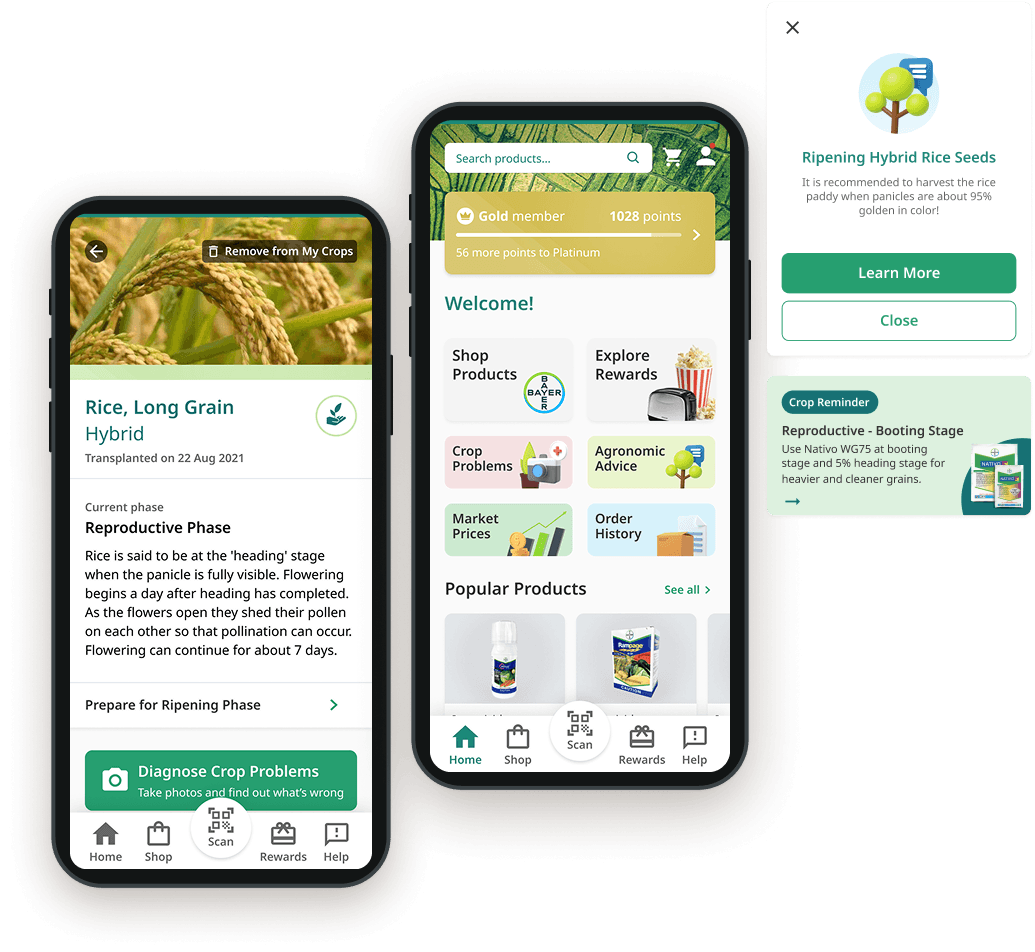
Visually-driven homepage navigation
Farmers need a quick and easy way to navigate the app.
Design Changes: We simplified entry points using large, icon-based category tiles, mirroring familiar shopping apps.
Observation: Farmers quickly understood categories like "Shop Products" and "Explore Rewards" despite limited digital experience.
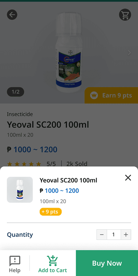
Product cards & e-commerce patterns
Farmers need a simple and intuitive shopping experience.
Design Changes: We used recognisable product cards with prices, images, and retailer info. Making use of familiar e-commerce patterns like “add to cart” and “buy now” to reduce confusion.
Observation: Most farmers began their shopping journey through these, echoing Shopee behaviours.


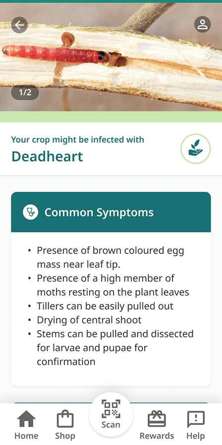
Agronomic Advice
Farmers are keen to improve their yields through agronomic advice if it’s simple to access and understand.
Design Changes: A quick-entry feature for crop help and product recommendations.
Observation: Farmers appreciated having a simple path to diagnose issues and receive recommendations.


Here are some changes we made based on the user insights:
Visually-driven homepage navigation
Farmers need a quick and easy way to navigate the app.
Design Changes: We simplified entry points using
large, icon-based category tiles, mirroring familiar
shopping apps.
Observation: Farmers quickly understood categories like "Shop Products" and "Explore Rewards" despite limited digital experience.
Product cards & e-commerce patterns
Farmers need a simple and intuitive shopping experience.
Design Changes: We used recognisable product cards with prices, images, and retailer info. Making use of familiar e-commerce patterns like “add to cart” and “buy now” to reduce confusion.
Observation: Most farmers began their shopping journey through these, echoing Shopee behaviours.
Agronomic Advice
Farmers are keen to improve their yields
through agronomic advice if it’s simple to
access and understand.
Design Changes: A quick-entry feature for crop help and product recommendations.
Observation: Farmers appreciated having a simple path to diagnose issues and receive recommendations.
What I Learned
Design for familiarity
Learnability improves when users can draw from familiar patterns. Many farmers had used Shopee or similar apps, so we adopted UI patterns they already understood; image-led browsing, prominent search, and multiple purchase options like "Buy Now" or "Add to Cart". These helped reduce friction and made the experience feel natural.
Context over convention
Understanding users means letting go of what typically "makes sense". A simple header might seem tappable. Steps we assumed were helpful, like detailed onboarding, can create unnecessary friction. Many farmers preferred to skip and return later. Making skip options clearer reduced drop-off risk and supported autonomy. Adapting to their behaviours made the app not only more usable, but more respectful of their time and needs.
What I Learned
Design for familiarity
Learnability improves when users can draw from familiar patterns. Many farmers had used Shopee or similar apps, so we adopted UI patterns they already understood; image-led browsing, prominent search, and multiple purchase options like "Buy Now" or "Add to Cart". These helped reduce friction and made the experience feel natural.Context over convention
Understanding users means letting go of what typically "makes sense". A simple header might seem tappable. Steps we assumed were helpful, like detailed onboarding, can create unnecessary friction. Many farmers preferred to skip and return later. Making skip options clearer reduced drop-off risk and supported autonomy. Adapting to their behaviours made the app not only more usable, but more respectful of their time and needs.
ABOUT
WORK
CONTACT
Our main goal was to connect farmers digitally. We needed to make the app feel familiar, rewarding, and easy enough to become part of their daily habits.
Our main goal was to connect farmers digitally. We needed to
make the app feel familiar, rewarding, and easy enough to become part of their daily habits.
To stay on track, we focused on the most essential activities: exploration, design conceptualisation, user flow & wireframing, and design iteration.
Exploration phase:
Research on available best practices on designing for low digital literacy users
Research on popular and widely-used apps in rural areas across
target countriesIdentified key design patterns and interactions that helped increase user learnability


Design conceptualisation:
Workshop with regional Bayer teams to uncover visual preferences and expectations
Reviewed different app references (from Agronomic apps,
e-commerce to loyalty programmes design) to align on tone and
visual direction
User flow & wireframing:
Created user flows to ensure the end-to-end process felt seamless and intuitive
Developed low-fidelity wireframes to visualise content prioritisation and structure
Design Iteration:
Refined interaction patterns, visual design, and copy based on insights gathered from user-testing
Prioritised changes based on impact effort matrix
To stay on track,
we focused on the most essential activities:
Exploration phase:
Design conceptualisation:
User flow & wireframing:
Design Iteration:
ABOUT
WORK
CONTACT
WANT TO KNOW MORE
ABOUT MY WORK?
DROP ME AN EMAIL AT ARISTA.KHOO@GMAIL.COM
WANT TO KNOW MORE
ABOUT MY WORK?
DROP ME AN EMAIL AT ARISTA.KHOO@GMAIL.COM
Increased System Usability Scale (SUS) scores by
8% with the first iteration
Improved task completion rates by 20% with the
first iteration
Increased System Usability Scale (SUS)
scores by 8% with the first iteration
Improved task completion rates by
20% with the first iteration
UX DESIGNER
&
STRATEGIST